Empowering Blind/Low Vision Users with Onboarding and Unboxing Experience
Glidance, an accessibility startup, is launching their mobility aid, Glide for Blind/Low Vision users. By designing an onboarding and unboxing experience we to make the users feel confident and independent starting with their first interaction. We created intuitive and accessible packaging design to be paired with a companion app to guide users through a meaningful experience.

Team Lead
Packaging Design (4 UX Designers, 2 Graphic Designers)
Tech, Accessibility
Aug-Dec 2024 (16 weeks)
Figma, Pacdora, Multimedia
Overview
Co-led a group of 6 designers in creating an unboxing experience for Blind/Low vision users through accessible packaging design. Our team created 2 final package designs that are intuitive and focus on auditory and textural cues to help make the users feel confident from the moment the package is delivered to their doorstep.
Outcome
Two intuitive accessible package designs.
Both designs tested well, each aligning with different priorities, one focused on accessibility and consistency, the other on innovation and experience. Together, they demonstrate a thoughtful balance between user needs, manufacturability, and brand storytelling.
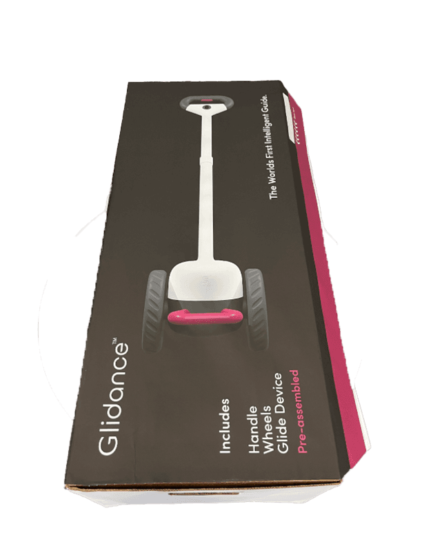
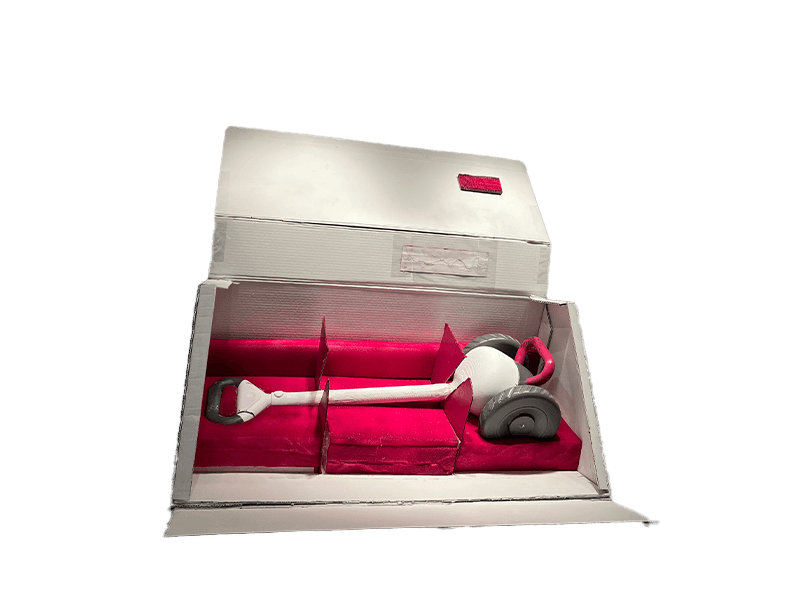
Rectangle
A refined take on the traditional box, this design went through multiple prototype stages (¼, ½, and full scale) to perfect form and function. Key features:
Integrated braille for accessibility
Pull-strips for intuitive, frustration-free unboxing with satisfying auditory feedback
Layered foam inserts for secure, elegant presentation
Triangle "The Toblerone"
This exploratory concept reimagines packaging with a bold triangular form. Despite its unconventional shape, it tested strongly due to its premium feel and distinctive interaction. Key elements include:
Directional opening—three-sided shape guides a single, intuitive unboxing method
Multi-orientation design—consistent experience whether upright or flat
Showcase-style inserts—angled cutouts highlight the product from first glance

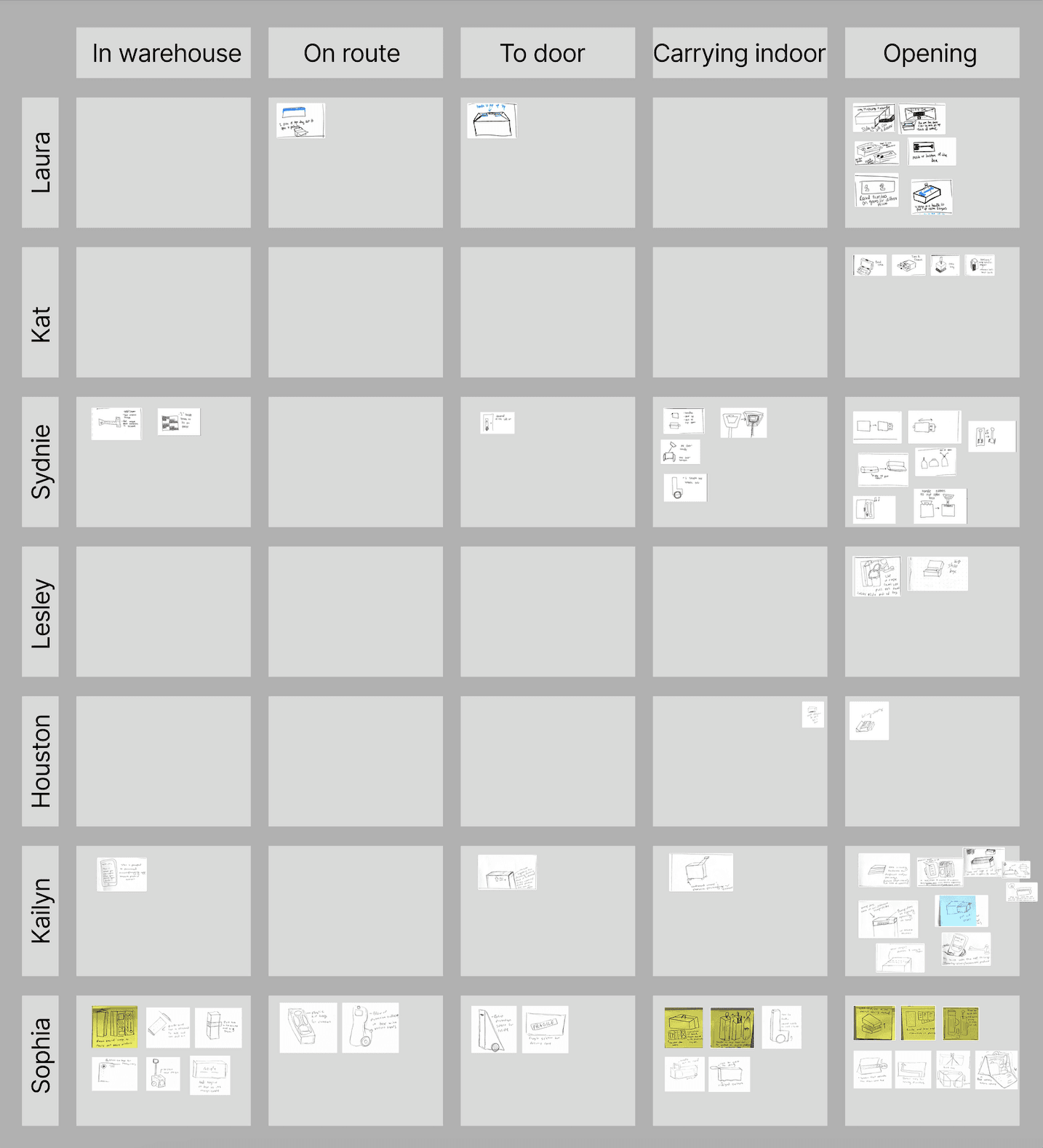
Process at a Glance
Research & Analysis: We analyzed different package designs while also comparing accessibility packaging from other companies to identify successful aspects and possible improvements. Completed a competitive analysis of other mobility aid companies and their unboxing experience.
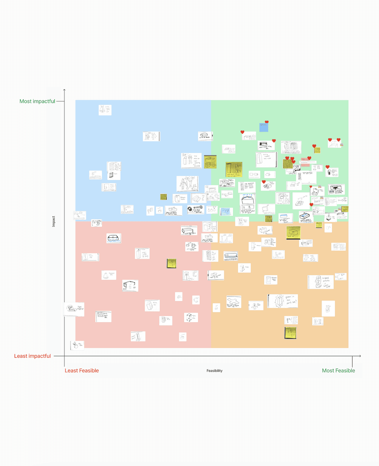
Ideation & Feasibility Matrix: Ideated 168 ideas and organized them to focus on the feasibility and impact while also finding specific aspects to move forward with to test.
Prototyping: Created 25 total prototypes at 1/4, 1/2, and full scale and tested with over 35 Blind/Low vision users.
Usability Testing: We conducted bi-weekly testing using 4 success metrics to identify the success of our prototypes at each stage and size.
Material Pricing: We organized meetings with manufactures and warehouses to compare material pricing for recommendations along with shipping layouts and requirements. Aided in the ability to create both boxes under budget.

Organizing 168 ideas from the warehouse to the front door step
Taking a holistic approach to packaging strategy to ensure the package met real-world demands, we evaluated 168 ideas through a comprehensive lens that balances cost, feasibility, and user experience across each stage of the package journey. Our evaluation process included:
Warehouse logistics
All concepts were assessed against standard pallet dimensions (48" x 42" x 42–48" max height). Rectangular: 34" x 14" x 10", Triangular: 32" x 17" x 14.5" were optimized to stack securely, maximize pallet footprint, and remain within height tolerances.
Shipping & Transit
Package geometry was refined to ensure efficient use of vehicle space, minimizing voids and reducing risk of damage during transport.Delivery Experience
Box orientation, labeling, and handle placement were considered for ease of last-mile delivery to ensure the package could be placed correctly at the doorstep.In-Home Handling & Unboxing
Final designs prioritized how users would lift, carry, and interact with the packaging. Orientation, tactile cues (pull strips, braille), and internal structure contributed to a clear, accessible, and premium unboxing experience.
Iterating, scaling and refining with the user in mind
We began with a wide range of small-scale prototypes (¼ and ½ size) to explore structural ideas quickly and cost-effectively. As concepts were refined, we scaled up to full-size models while narrowing down the selection—shifting from breadth to depth.
Throughout the process, we conducted user testing and made continuous improvements based on four key success metrics:
Time to unbox
Feature clarity
User-reported satisfaction
Re-package ability
This approach allowed us to design not just for visual appeal, but for a seamless, enjoyable, and repeatable user experience, validated at every stage through real feedback and functional testing.

Insights from 29 Blind/Low Vision Users
We tested with 29 blind and low vision (BLV) users and 8 blindfolded participants to ensure our packaging was intuitive, inclusive, and enjoyable.
What We Learned:
High-Contrast Visuals Help
Bright colors and large text like “Tear here” improved usability for users with partial vision.Tactile Cues Were Crucial
81% of users with no vision relied on textures, ridges, and bumps to orient and open the box.
Braille was appreciated by those who could read it, but non-braille tactile cues benefited everyone.Sound Matters
Pull-strips and tearable sections provided useful auditory feedback, adding clarity and satisfaction.Flap Design Needs Attention
Some users struggled with box flaps getting in the way, pointing to the need for cleaner closure systems.Onboarding Must Be Multi-Modal
Tech comfort varied, so inserts should include both large-text and braille, plus a QR code or link with a tactile boundary for easy setup access.
Outcome:
A packaging system that’s clear, tactile, and inclusive, designed with real feedback from users who rely on more than just sight.

Confidently unboxing with two accessible designs
We delivered two distinct packaging solutions, both designed specifically for blind and low vision users—each tested, reviewed, and refined through direct user feedback. Every detail, from tactile cues and braille to structural design and unboxing flow, was crafted to build confidence, clarity, and independence. Both boxes were kept under a $5 manufacturing budget, balancing accessibility, creativity, and cost-efficiency—proof that inclusive design doesn’t require compromise.