Enhancing Online Purchases with iOS

Identifier is a seamless shopping experience that connects the iOS camera, Apple Pay, and Apple Watch, making it easy for users to go from visual discovery to purchase in seconds. This project explores how to unify these tools within Apple’s ecosystem, creating a fast, intuitive, and brand-aligned flow that supports real-world, on-the-go shopping behavior.

My Role

My Role

UX Designer

Industry

Industry

Tech, Retail

Timeline

Timeline

Apr-May 2023 (4 weeks)

Tools

Tools

Figma, Adobe XD

Overview

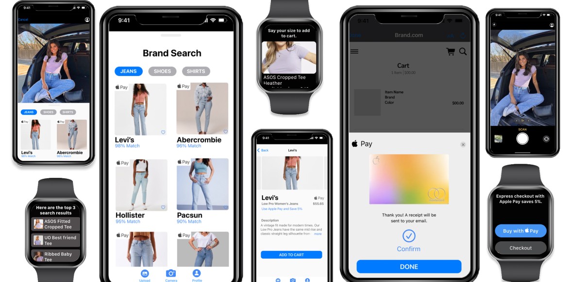
People often spot products in the real world or in their photo library and want a quick way to find and buy them. Yet within Apple’s ecosystem, there’s no seamless path from visual discovery to purchase.

This project set out to bridge that gap—designing a fast, intuitive shopping experience that connects the iOS camera and Apple Pay. The goal: make purchasing as effortless as snapping a photo, while staying true to Apple’s design principles and ecosystem.

Outcome

Apple has two standout features—Apple Pay and the iOS camera—but there is no seamless way to integrate them for shopping. While the Photos app offers an image search feature, it does not connect to Apple Pay for instant purchases.

As the sole designer, I ideated, sketched, and designed an iOS experience that reimagines online shopping by leveraging the iPhone and Apple Watch for a more intuitive, efficient purchasing process.

Process at a Glance

Foundation in Apple Human Interface Guidelines: Began by immersing in Apple's HIG to ensure the experience aligned with platform conventions, accessibility standards, and brand expectations.


iOS Ideation & Prototyping: Sketched interface concepts and developed interactive prototypes to visualize and refine the shopping experience.


User Testing: Conducted usability testing to identify friction points and opportunities to improve the effectiveness, speed, and overall experience.


VoiceOver Optimization for watchOS: Designed conversational cues and navigational patterns for VoiceOver to support accessibility and ensure a seamless experience for all users.


Apple Watch Integration: Extended functionality to watchOS with simplified, interfaces that support quick on-the-go interactions.

Understanding the Apple Ecosystem

To ground the design in user expectations, the process began with a close study of Apple’s Human Interface Guidelines (HIG) and platform patterns. This helped ensure an intuitive experience that fits naturally into the iOS and watchOS environments.

  • Identified key opportunities to integrate the camera, Apple Pay, and Apple Watch.

  • Focused on bridging the gap between product discovery and seamless checkout.

  • Established foundational design principles: clarity, speed, and platform alignment.

Rapid Ideation & Sketching

Using rapid ideation techniques like Crazy 8s, a wide range of ideas were explored quickly through low-fidelity sketches.

  • Prioritized intuitive interactions using familiar iOS gestures and UI patterns.

  • Sketched potential flows for discovery, recognition, and purchasing.

  • Grounded each concept in Apple’s design ethos—minimalism, clarity, and usability.

Wireframing and Flow Design

The most promising sketches were developed into low-fidelity wireframes, clarifying layout, flow and feature placement.

  • Defined and streamlined end-to-end experience from scan/search to Apple Pay checkout.

  • Used iOS conventions to create frictionless shopping path

  • Set a solid structure for usability testing and high-fidelity design.

The most promising sketches were developed into low-fidelity wireframes, clarifying layout, flow and feature placement.

  • Defined and streamlined end-to-end experience from scan/search to Apple Pay checkout.

  • Used iOS conventions to create frictionless shopping path.

  • Set a solid structure for usability testing and high-fidelity design.

High-Fidelity Prototyping & Usability Testing

A clickable prototype was built in Figma and tested with users that fit the target audience.

Key Insight: Font size and hierarchy made navigation feel unclear for some users, particularly those with visual impairments.
Solutions:

  • Increased font size and adjusted contrast for improved readability.

  • Refined visual hierarchy to better guide user attention.

  • Introduced an Apple Pay discount incentive—encouraging adoption and aligning with Apple’s business model (in 2022, Apple Pay processed $6T in payments, generating $1.9B in revenue).

A clickable prototype was built in Figma and tested with users that fit the target audience.

Key Insight: Font size and hierarchy made navigation feel unclear for some users, particularly those with visual impairments.
Solutions:

  • Increased font size and adjusted contrast for improved readability.

  • Refined visual hierarchy to better guide user attention.

  • Introduced an Apple Pay discount incentive, encouraging adoption and aligning with Apple’s business model (in 2022, Apple Pay processed $6T in payments, generating $1.9B in revenue).

watchOS Voice Interaction Design

To expand accessibility and multi-device convenience, a voice-first experience was created for Apple Watch.

  • Designed for three key use cases: brand recognition, media references, and past searches.

  • Built conversational flows in VoiceFlow to simulate natural Siri-style interactions.

  • Focused on VoiceOver compatibility—emphasizing clarity, simplicity, and non-visual feedback.

To expand accessibility and multi-device convenience, a voice-first experience was created for Apple Watch.

  • Designed for three key use cases: brand recognition, media references, and past searches.

  • Built conversational flows in VoiceFlow to simulate natural Siri-style interactions.

  • Focused on VoiceOver compatibility, emphasizing clarity, simplicity, and non-visual feedback.

Final UI Design

The final screens integrated feedback, visual polish, and seamless cross-device functionality.

  • Aligned fully with Apple’s visual and interaction guidelines.

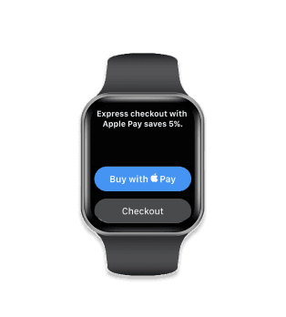
  • Created a four-screen purchase flow that felt lightweight, fast, and native.

  • Designed for both iPhone and Apple Watch to support continuity and convenience.

Click on watch to access prototype

Conclusion

This project allowed me to expand my skill set by learning Adobe XD and VoiceFlow, while also refining my Figma prototyping expertise. I applied Apple's Human Interface Guidelines (HIG) to ensure the experience aligned with Apple’s interface and style principles.

Beyond design, I gained insight into Apple Pay’s revenue model and explored ways to increase both user convenience and Apple’s profitability by integrating complementary features.

If I were to revisit this project, I would prioritize more frequent user testing—starting from sketches to low-fidelity screens and eventually to a fully functional prototype. This would be especially beneficial for WatchOS and voice interactions, as they were new platforms for me, and continuous user feedback would have strengthened both the final experience and my own learning process.

This project allowed me to expand my skill set by learning Adobe XD and VoiceFlow, while also refining my Figma prototyping expertise. I applied Apple's Human Interface Guidelines (HIG) to ensure the experience aligned with Apple’s interface and style principles.

Beyond design, I gained insight into Apple Pay’s revenue model and explored ways to increase both user convenience and Apple’s profitability by integrating complementary features.

If I were to revisit this project, I would prioritize more frequent user testing, starting from sketches to low-fidelity screens and eventually to a fully functional prototype. This would be especially beneficial for WatchOS and voice interactions, as they were new platforms for me, and continuous user feedback would have strengthened both the final experience and my own learning process.

What can we design together?

What can we design together?

What can we design together?